cdc <- data.frame(
  year = c(1922L,1923L,1924L,1925L,
           1926L,1927L,1928L,1929L,1930L,1931L,
           1932L,1933L,1934L,1935L,1936L,
           1937L,1938L,1939L,1940L,1941L,1942L,
           1943L,1944L,1945L,1946L,1947L,
           1948L,1949L,1950L,1951L,1952L,
           1953L,1954L,1955L,1956L,1957L,1958L,
           1959L,1960L,1961L,1962L,1963L,
           1964L,1965L,1966L,1967L,1968L,1969L,
           1970L,1971L,1972L,1973L,1974L,
           1975L,1976L,1977L,1978L,1979L,1980L,
           1981L,1982L,1983L,1984L,1985L,
           1986L,1987L,1988L,1989L,1990L,
           1991L,1992L,1993L,1994L,1995L,1996L,
           1997L,1998L,1999L,2000L,2001L,
           2002L,2003L,2004L,2005L,2006L,2007L,
           2008L,2009L,2010L,2011L,2012L,
           2013L,2014L,2015L,2016L,2017L,2018L,
           2019L,2020L,2021L,2022L,2023L,2024L, 2025L),
  cases = c(107473,164191,165418,152003,
            202210,181411,161799,197371,
            166914,172559,215343,179135,265269,
            180518,147237,214652,227319,103188,
            183866,222202,191383,191890,109873,
            133792,109860,156517,74715,69479,
            120718,68687,45030,37129,60886,
            62786,31732,28295,32148,40005,
            14809,11468,17749,17135,13005,6799,
            7717,9718,4810,3285,4249,3036,
            3287,1759,2402,1738,1010,2177,2063,
            1623,1730,1248,1895,2463,2276,
            3589,4195,2823,3450,4157,4570,
            2719,4083,6586,4617,5137,7796,6564,
            7405,7298,7867,7580,9771,11647,
            25827,25616,15632,10454,13278,
            16858,27550,18719,48277,28639,32971,
            20762,17972,18975,15609,18617,
            6124,2116,3044,7063,22538,21996)
)Class 18: Pertussis Mini Project
Background
Pertussis (whooping cough) is a common lung infection caused by the bacteria B. Pertussis. It can infect anyone but is most deadly for infants (under 1 year of age).
CDC Tracking Data
The CDC tracks the number of of Pertussis cases:
Q1. With the help of the R “addin” package datapasta assign the CDC pertussis case number data to a data frame called cdc and use ggplot to make a plot of cases numbers over time.
Note
library(ggplot2)

ggplot(cdc) +
  aes(year, cases) +
  geom_point() +
  geom_line() +
  labs(x = "Year", y = "Number of cases", title = "Pertussis Cases by Year (1922 - 2025)")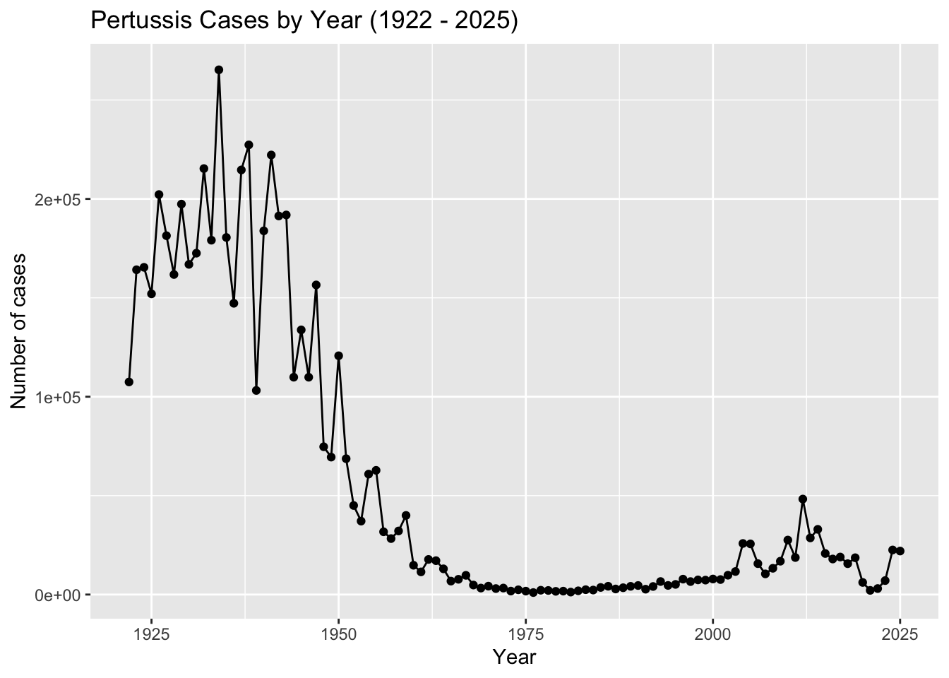
Q2. Using the ggplot geom_vline() function add lines to your previous plot for the 1946 introduction of the wP vaccine and the 1996 switch to aP vaccine (see example in the hint below). What do you notice?
Q. Add annotation lines for the major milestones of wP vaccination roll-out (1946) and the switch to the aP vaccine (1996).
ggplot(cdc) +
  aes(year, cases) +
  geom_point() +
  geom_line() +
  labs(x = "Year", y = "Number of cases",
       title = "Pertussis Cases by Year (1922 - 2025)") +
  geom_vline(xintercept = 1946, col = "blue", lty = 2) +
  geom_vline(xintercept = 1996, col = "red", lty = 2) +
  geom_vline(xintercept = 2020, col = "gray", lty = 2)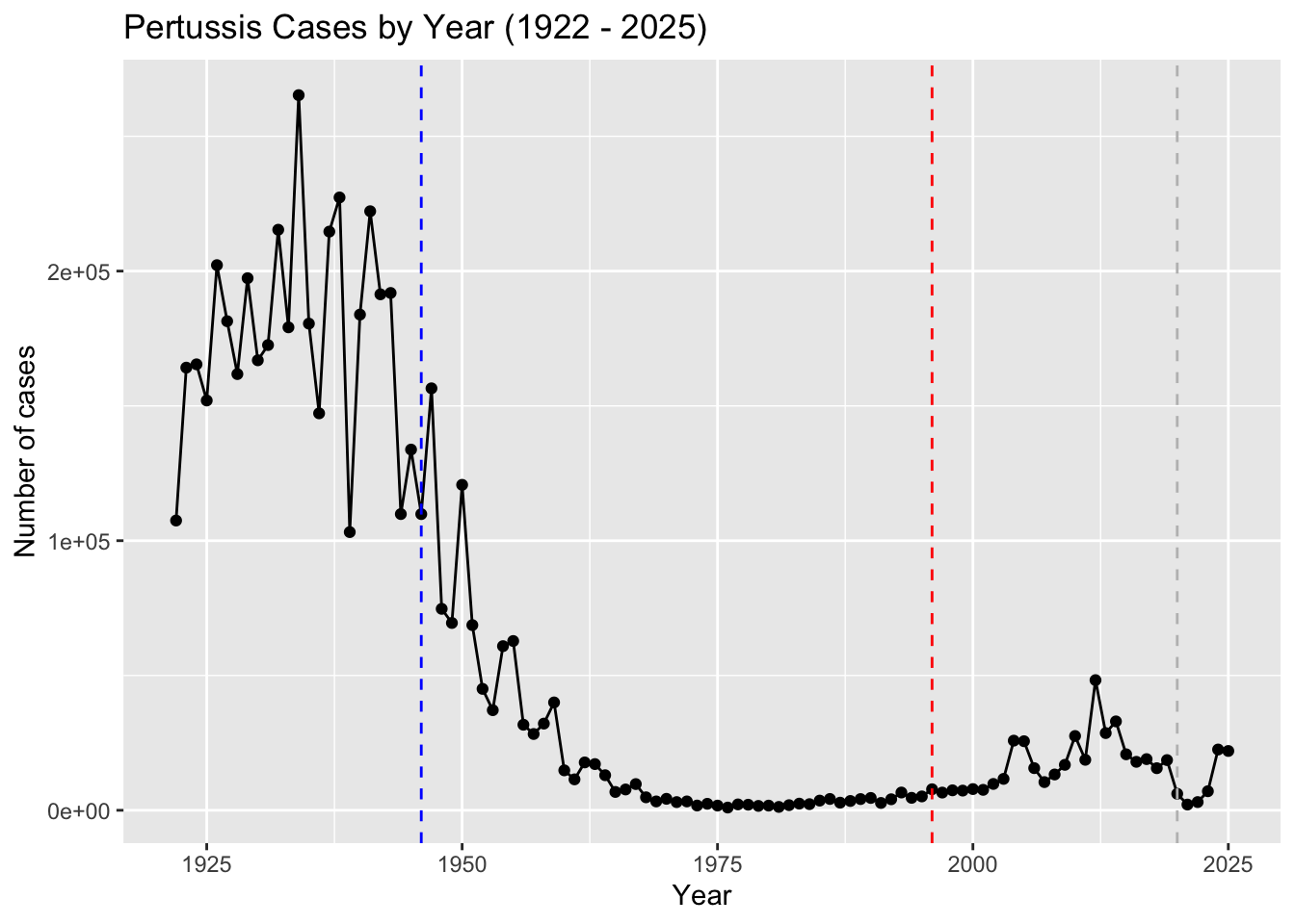
Q3. Describe what happened after the introduction of the aP vaccine? Do you have a possible explanation for the observed trend?
After the introduction of the aP vaccine, the number of cases of Pertussis decreased a significant amount. Making the aP vaccine safer and more effective with less side effects than the wP vaccine could have caused less cases and people to be more confident in the vaccine. After a while, it seems like the number of cases started to rise again, which could be due to how the weakening of the aP vaccine with less side effects and an increased number of testing.
Exploring CMI-PB Data
The CMI-PB project’s < https://www.cmi-pb.org/ > is to provide the scientific community with a comprehensive, high-quality and freely accessible resource of Pertussis booster vaccination.
Basically, they make available a large dataset on the immune response to Pertussis. They use a “booster” vaccination as a proxy for Pertussis infection.
They make their data available as a JSON format API. We can read this into R with the read_json() function from the jsonlite package:
library(jsonlite)
subject <- read_json("https://www.cmi-pb.org/api/v5_1/subject",
                     simplifyVector = TRUE)
head(subject)
subject_id infancy_vac biological_sex ethnicity race
1 1 wP Female Not Hispanic or Latino White
2 2 wP Female Not Hispanic or Latino White
3 3 wP Female Unknown White
4 4 wP Male Not Hispanic or Latino Asian
5 5 wP Male Not Hispanic or Latino Asian
6 6 wP Female Not Hispanic or Latino White
year_of_birth date_of_boost dataset
1 1986-01-01 2016-09-12 2020_dataset
2 1968-01-01 2019-01-28 2020_dataset
3 1983-01-01 2016-10-10 2020_dataset
4 1988-01-01 2016-08-29 2020_dataset
5 1991-01-01 2016-08-29 2020_dataset
6 1988-01-01 2016-10-10 2020_datasetQ4. How many aP and wP infancy vaccinated subjects are in the dataset?
How many aP and wP individual are there in this
subjecttable?
table(subject$infancy_vac)
aP wP
87 85
Q5. How many Male and Female subjects/patients are in the dataset?
table(subject$biological_sex)
Female   Male
   112     60
Q6. What is the breakdown of race and biological sex (e.g. number of Asian females, White males etc…)?
table(subject$race, subject$biological_sex)
                                            Female Male
  American Indian/Alaska Native                  0    1
  Asian                                         32   12
  Black or African American                      2    3
  More Than One Race                            15    4
  Native Hawaiian or Other Pacific Islander      1    1
  Unknown or Not Reported                       14    7
  White                                         48   32
Q. Is this representative of the US population?
No, this is not representative of the US population.
Working with Dates:
library(lubridate)
Attaching package: 'lubridate'The following objects are masked from 'package:base':
date, intersect, setdiff, uniontoday()[1] "2026-03-07"today() - ymd("2000-01-01")Time difference of 9562 daystime_length( today() - ymd("2000-01-01"), "years")[1] 26.17933Q7. Using this approach determine (i) the average age of wP individuals, (ii) the average age of aP individuals; and (iii) are they significantly different?
library(dplyr)
Attaching package: 'dplyr'The following objects are masked from 'package:stats':
filter, lagThe following objects are masked from 'package:base':
intersect, setdiff, setequal, unionsubject$age <- today() - ymd(subject$year_of_birth)
ap <- subject |> filter(infancy_vac == "aP")
round( summary( time_length( ap$age, "years" ) ) ) Min. 1st Qu. Median Mean 3rd Qu. Max.
23 27 28 28 29 35 wp <- subject %>% filter(infancy_vac == "wP")
round( summary( time_length( wp$age, "years" ) ) ) Min. 1st Qu. Median Mean 3rd Qu. Max.
23 33 35 37 40 58 t.test(ap$age, wp$age)
    Welch Two Sample t-test

data:  ap$age and wp$age
t = -12.918 days, df = 104.03, p-value < 2.2e-16
alternative hypothesis: true difference in means is not equal to 0
95 percent confidence interval:
 -3686.855 days -2705.535 days
sample estimates:
Time differences in days
mean of x mean of y
 10254.28  13450.47
Q8. Determine the age of all individuals at time of boost?
int <- ymd(subject$date_of_boost) - ymd(subject$year_of_birth)
age_at_boost <- time_length(int, "year")
head(age_at_boost)
[1] 30.69678 51.07461 33.77413 28.65982 25.65914 28.77481Q9. With the help of a faceted boxplot or histogram (see below), do you think these two groups are significantly different?
Yes, these two groups are significantly different.
ggplot(subject) +
  aes(time_length(age, "year"),
      fill=as.factor(infancy_vac)) +
  geom_histogram(show.legend=FALSE) +
  facet_wrap(vars(infancy_vac), nrow=2) +
  xlab("Age in years")
`stat_bin()` using `bins = 30`. Pick better value with `binwidth`.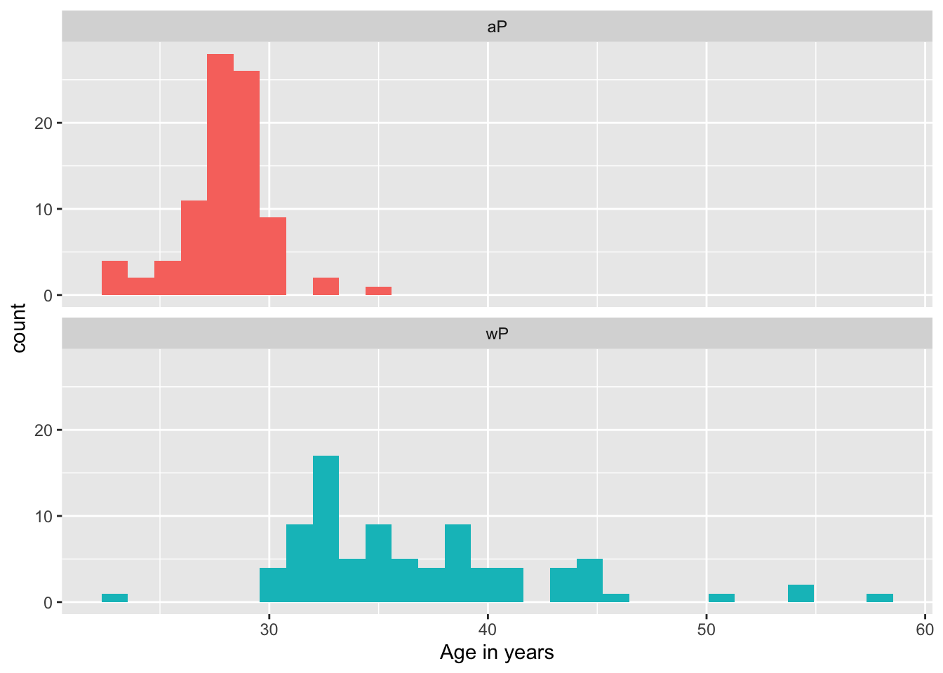
x <- t.test(time_length( wp$age, "years" ),
       time_length( ap$age, "years" ))

x$p.value
[1] 2.372101e-23We can read more tables from the CMI-PB database
specimen <- read_json("https://www.cmi-pb.org/api/v5_1/specimen",
                      simplifyVector = TRUE)
ab_titer <- read_json("https://www.cmi-pb.org/api/v5_1/plasma_ab_titer",
simplifyVector = TRUE)head(specimen) specimen_id subject_id actual_day_relative_to_boost
1 1 1 -3
2 2 1 1
3 3 1 3
4 4 1 7
5 5 1 11
6 6 1 32
planned_day_relative_to_boost specimen_type visit
1 0 Blood 1
2 1 Blood 2
3 3 Blood 3
4 7 Blood 4
5 14 Blood 5
6 30 Blood 6head(ab_titer) specimen_id isotype is_antigen_specific antigen MFI MFI_normalised
1 1 IgE FALSE Total 1110.21154 2.493425
2 1 IgE FALSE Total 2708.91616 2.493425
3 1 IgG TRUE PT 68.56614 3.736992
4 1 IgG TRUE PRN 332.12718 2.602350
5 1 IgG TRUE FHA 1887.12263 34.050956
6 1 IgE TRUE ACT 0.10000 1.000000
unit lower_limit_of_detection
1 UG/ML 2.096133
2 IU/ML 29.170000
3 IU/ML 0.530000
4 IU/ML 6.205949
5 IU/ML 4.679535
6 IU/ML 2.816431To make sense of all this data, we need to “join” (a.k.a. merge or “link”) all of these tables together. Only then will you know that a given Ab measurement (from the ab_titer table) was collected on a certain date (from the specimen table) from a certain wP or aP subject (from the subject table).
We can use dplyr and the *.join() family of functions to do this.
Q9. Complete the code to join specimen and subject tables to make a new merged data frame containing all specimen records along with their associated subject details:
library(dplyr)
meta <- inner_join(subject, specimen)
Joining with `by = join_by(subject_id)`dim(meta)[1] 1503 14head(meta) subject_id infancy_vac biological_sex ethnicity race
1 1 wP Female Not Hispanic or Latino White
2 1 wP Female Not Hispanic or Latino White
3 1 wP Female Not Hispanic or Latino White
4 1 wP Female Not Hispanic or Latino White
5 1 wP Female Not Hispanic or Latino White
6 1 wP Female Not Hispanic or Latino White
year_of_birth date_of_boost dataset age specimen_id
1 1986-01-01 2016-09-12 2020_dataset 14675 days 1
2 1986-01-01 2016-09-12 2020_dataset 14675 days 2
3 1986-01-01 2016-09-12 2020_dataset 14675 days 3
4 1986-01-01 2016-09-12 2020_dataset 14675 days 4
5 1986-01-01 2016-09-12 2020_dataset 14675 days 5
6 1986-01-01 2016-09-12 2020_dataset 14675 days 6
actual_day_relative_to_boost planned_day_relative_to_boost specimen_type
1 -3 0 Blood
2 1 1 Blood
3 3 3 Blood
4 7 7 Blood
5 11 14 Blood
6 32 30 Blood
visit
1 1
2 2
3 3
4 4
5 5
6 6Q10. Now using the same procedure join meta with titer data so we can further analyze this data in terms of time of visit aP/wP, male/female etc.
Let’s do one more inner_join() to join the ab_titer with all our meta data.
abdata <- inner_join(ab_titer, meta)Joining with `by = join_by(specimen_id)`head(abdata) specimen_id isotype is_antigen_specific antigen MFI MFI_normalised
1 1 IgE FALSE Total 1110.21154 2.493425
2 1 IgE FALSE Total 2708.91616 2.493425
3 1 IgG TRUE PT 68.56614 3.736992
4 1 IgG TRUE PRN 332.12718 2.602350
5 1 IgG TRUE FHA 1887.12263 34.050956
6 1 IgE TRUE ACT 0.10000 1.000000
unit lower_limit_of_detection subject_id infancy_vac biological_sex
1 UG/ML 2.096133 1 wP Female
2 IU/ML 29.170000 1 wP Female
3 IU/ML 0.530000 1 wP Female
4 IU/ML 6.205949 1 wP Female
5 IU/ML 4.679535 1 wP Female
6 IU/ML 2.816431 1 wP Female
ethnicity race year_of_birth date_of_boost dataset
1 Not Hispanic or Latino White 1986-01-01 2016-09-12 2020_dataset
2 Not Hispanic or Latino White 1986-01-01 2016-09-12 2020_dataset
3 Not Hispanic or Latino White 1986-01-01 2016-09-12 2020_dataset
4 Not Hispanic or Latino White 1986-01-01 2016-09-12 2020_dataset
5 Not Hispanic or Latino White 1986-01-01 2016-09-12 2020_dataset
6 Not Hispanic or Latino White 1986-01-01 2016-09-12 2020_dataset
age actual_day_relative_to_boost planned_day_relative_to_boost
1 14675 days -3 0
2 14675 days -3 0
3 14675 days -3 0
4 14675 days -3 0
5 14675 days -3 0
6 14675 days -3 0
specimen_type visit
1 Blood 1
2 Blood 1
3 Blood 1
4 Blood 1
5 Blood 1
6 Blood 1Q11. How many different Ab “isotypes” values are in this dataset?
table(abdata$isotype)
  IgE   IgG  IgG1  IgG2  IgG3  IgG4
 6698  7265 11993 12000 12000 12000
Q12. How many different “antigen” values are measured?
table(abdata$antigen)
    ACT   BETV1      DT   FELD1     FHA  FIM2/3   LOLP1     LOS Measles     OVA
   1970    1970    6318    1970    6712    6318    1970    1970    1970    6318
    PD1     PRN      PT     PTM   Total      TT
   1970    6712    6712    1970     788    6318
Let’s focus on IgG isotype
igg <- abdata |> filter(isotype == "IgG")

head(igg)
specimen_id isotype is_antigen_specific antigen MFI MFI_normalised
1 1 IgG TRUE PT 68.56614 3.736992
2 1 IgG TRUE PRN 332.12718 2.602350
3 1 IgG TRUE FHA 1887.12263 34.050956
4 19 IgG TRUE PT 20.11607 1.096366
5 19 IgG TRUE PRN 976.67419 7.652635
6 19 IgG TRUE FHA 60.76626 1.096457
unit lower_limit_of_detection subject_id infancy_vac biological_sex
1 IU/ML 0.530000 1 wP Female
2 IU/ML 6.205949 1 wP Female
3 IU/ML 4.679535 1 wP Female
4 IU/ML 0.530000 3 wP Female
5 IU/ML 6.205949 3 wP Female
6 IU/ML 4.679535 3 wP Female
ethnicity race year_of_birth date_of_boost dataset
1 Not Hispanic or Latino White 1986-01-01 2016-09-12 2020_dataset
2 Not Hispanic or Latino White 1986-01-01 2016-09-12 2020_dataset
3 Not Hispanic or Latino White 1986-01-01 2016-09-12 2020_dataset
4 Unknown White 1983-01-01 2016-10-10 2020_dataset
5 Unknown White 1983-01-01 2016-10-10 2020_dataset
6 Unknown White 1983-01-01 2016-10-10 2020_dataset
age actual_day_relative_to_boost planned_day_relative_to_boost
1 14675 days -3 0
2 14675 days -3 0
3 14675 days -3 0
4 15771 days -3 0
5 15771 days -3 0
6 15771 days -3 0
specimen_type visit
1 Blood 1
2 Blood 1
3 Blood 1
4 Blood 1
5 Blood 1
6 Blood 1Let’s make a plot of MFI_normalised values for all antigen values.
ggplot(igg) +
  aes(MFI_normalised, antigen) +
  geom_boxplot()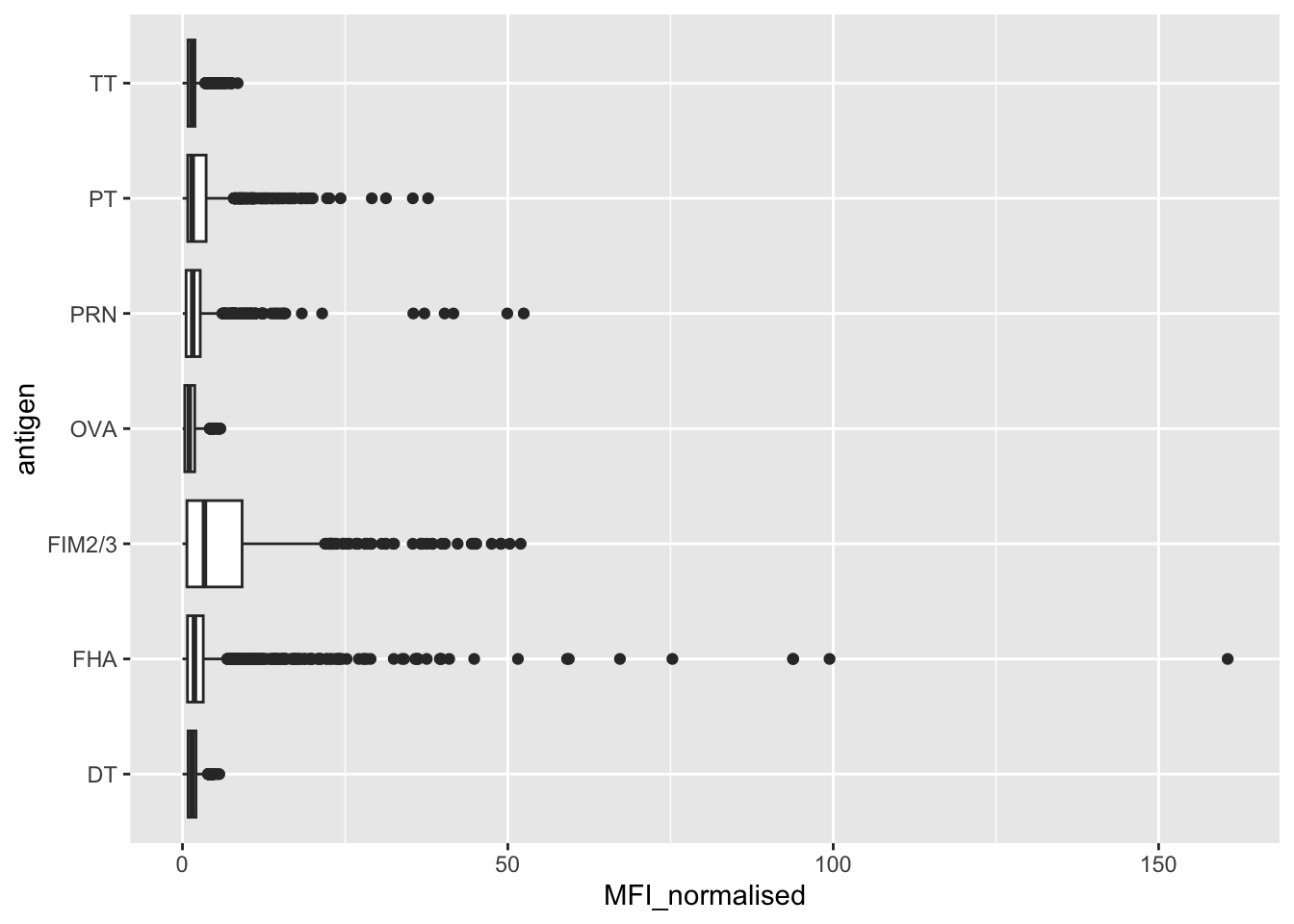
The antigens “PT”, “FIM2/3”, and “FHA” appear to have the widest range of values.
Q13. Complete the following code to make a summary boxplot of Ab titer levels (MFI) for all antigens:
ggplot(igg) +
  aes(MFI_normalised, antigen) +
  geom_boxplot() +
    xlim(0,75) +
  facet_wrap(vars(visit), nrow=2)
Warning: Removed 5 rows containing non-finite outside the scale range
(`stat_boxplot()`).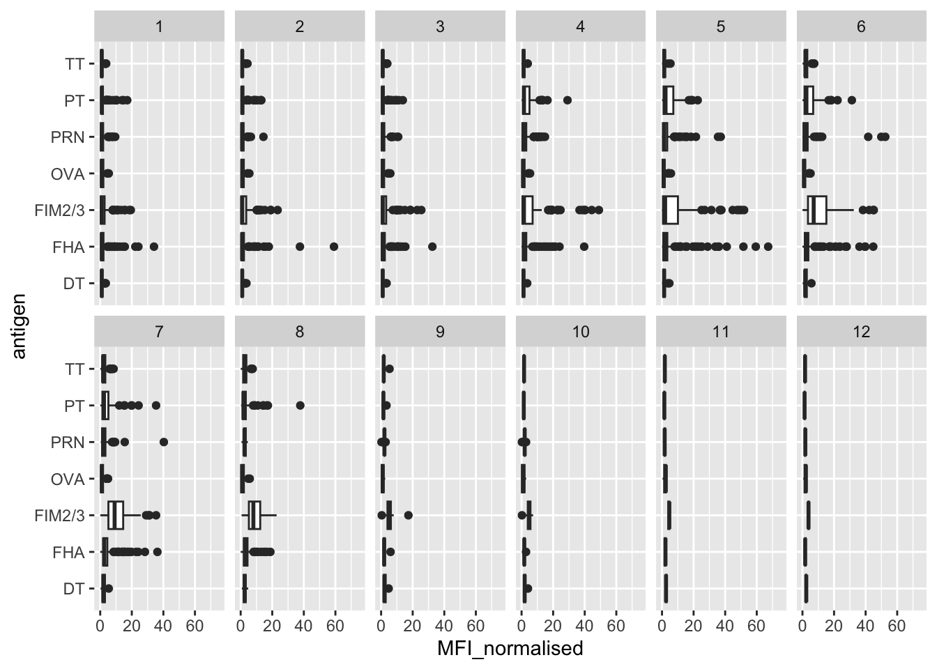
Q14. Is there a difference for these responses between aP and wP individuals?
The antigens “PT”, “FIM2/3”, and “FHA” appear to have the widest range of values.
ggplot(igg) +
  aes(MFI_normalised, antigen, col=infancy_vac) +
  geom_boxplot()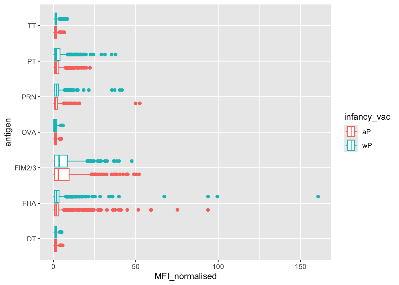
ggplot(igg) +
  aes(MFI_normalised, antigen, col=infancy_vac ) +
  geom_boxplot(show.legend = FALSE) +
  facet_wrap(vars(visit), nrow=2) +
  xlim(0,75) +
  theme_bw()
Warning: Removed 5 rows containing non-finite outside the scale range
(`stat_boxplot()`).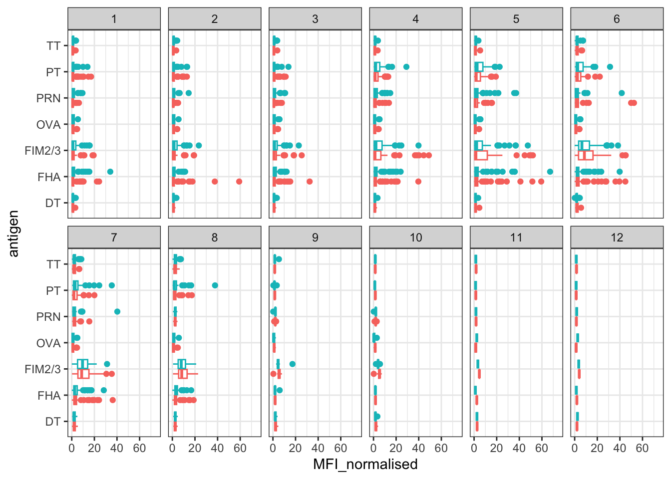
igg %>% filter(visit != 8) %>%
ggplot() +
  aes(MFI_normalised, antigen, col=infancy_vac ) +
  geom_boxplot(show.legend = FALSE) +
  xlim(0,75) +
  facet_wrap(vars(infancy_vac, visit), nrow=2)
Warning: Removed 5 rows containing non-finite outside the scale range
(`stat_boxplot()`).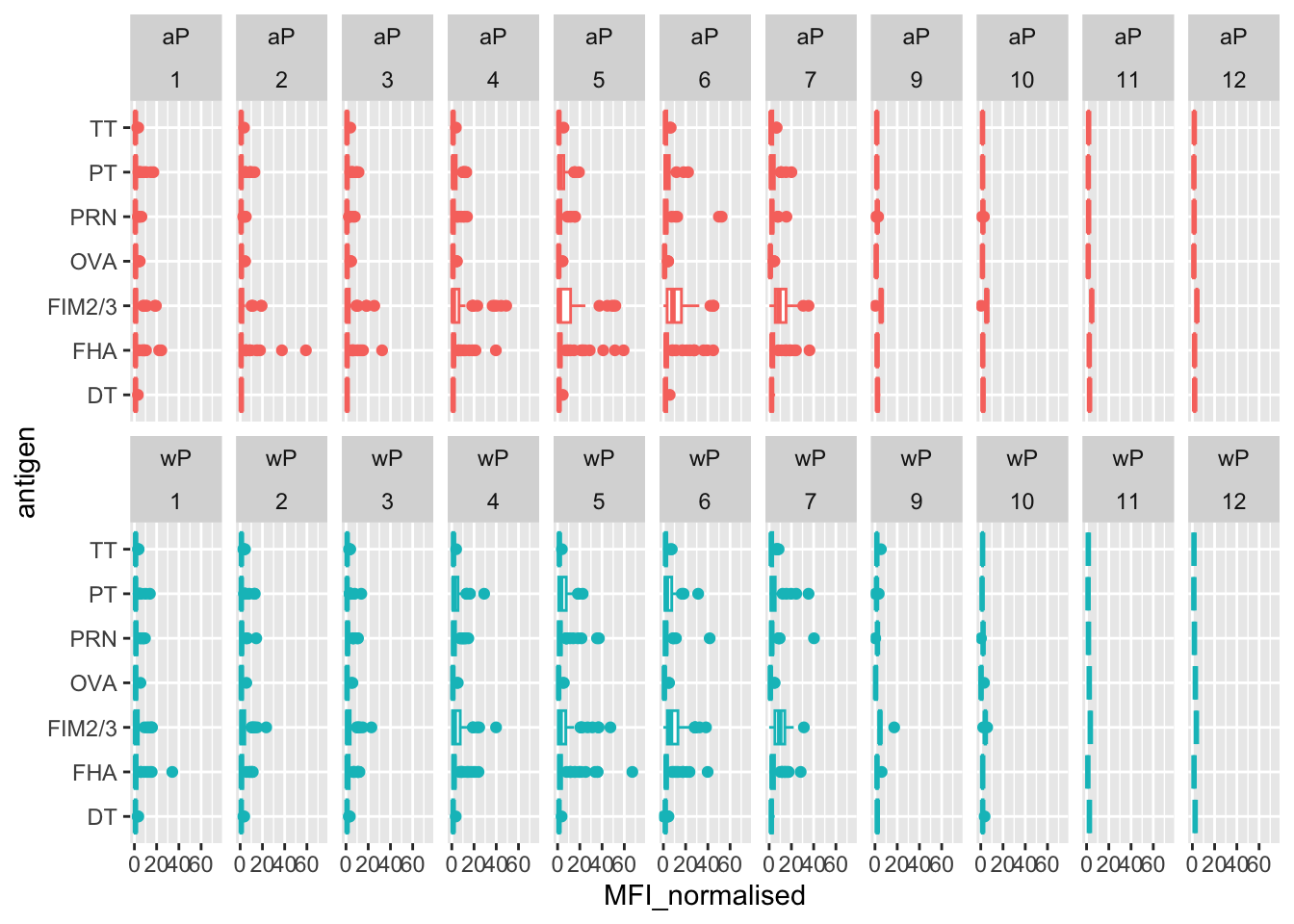
ggplot(igg) +
  aes(MFI_normalised, antigen, col=infancy_vac) +
  geom_boxplot() +
  facet_wrap(~infancy_vac)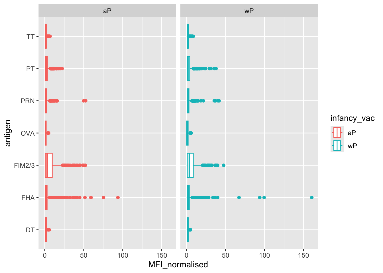
Is there a difference with time (i.e. before booster shot vs after booster shot)?
ggplot(igg) +
  aes(MFI_normalised, antigen, col=infancy_vac) +
  geom_boxplot() +
  facet_wrap(~visit)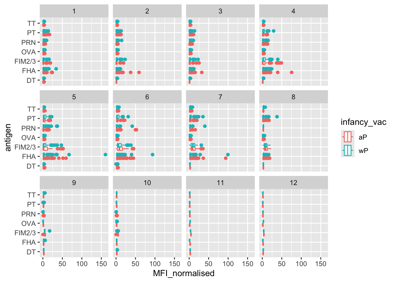
Q15. Filter to pull out only two specific antigens for analysis and create a boxplot for each. You can chose any you like. Below I picked a “control” antigen (“OVA”, that is not in our vaccines) and a clear antigen of interest (“PT”, Pertussis Toxin, one of the key virulence factors produced by the bacterium B. pertussis).
filter(igg, antigen=="OVA") %>%
  ggplot() +
  aes(MFI_normalised, col=infancy_vac) +
  geom_boxplot(show.legend = FALSE) +
  facet_wrap(vars(visit)) +
  theme_bw()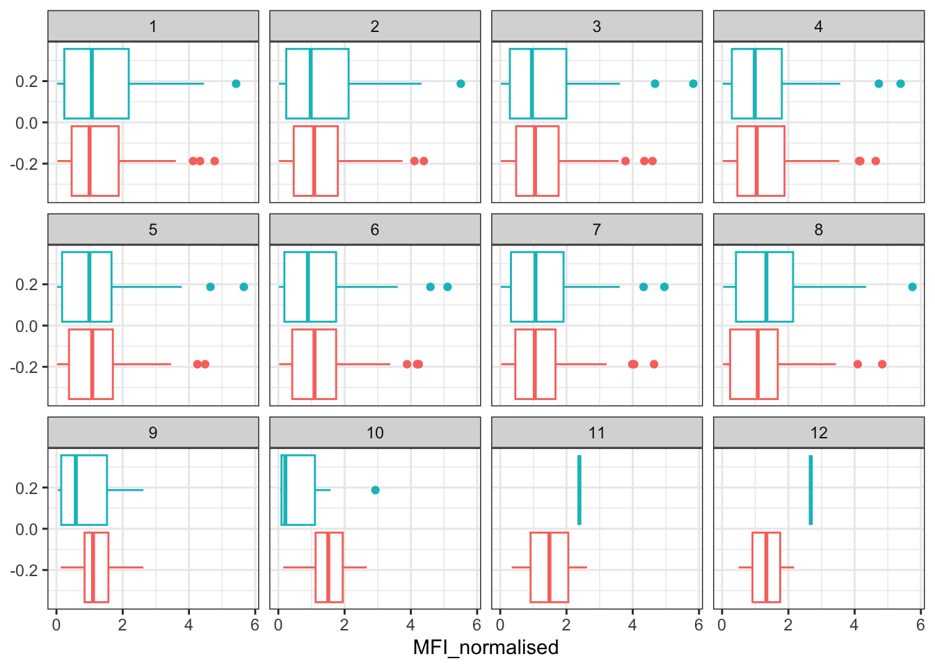
filter(igg, antigen=="PT") %>%
  ggplot() +
  aes(MFI_normalised, col=infancy_vac) +
  geom_boxplot(show.legend = FALSE) +
  facet_wrap(vars(visit)) +
  theme_bw()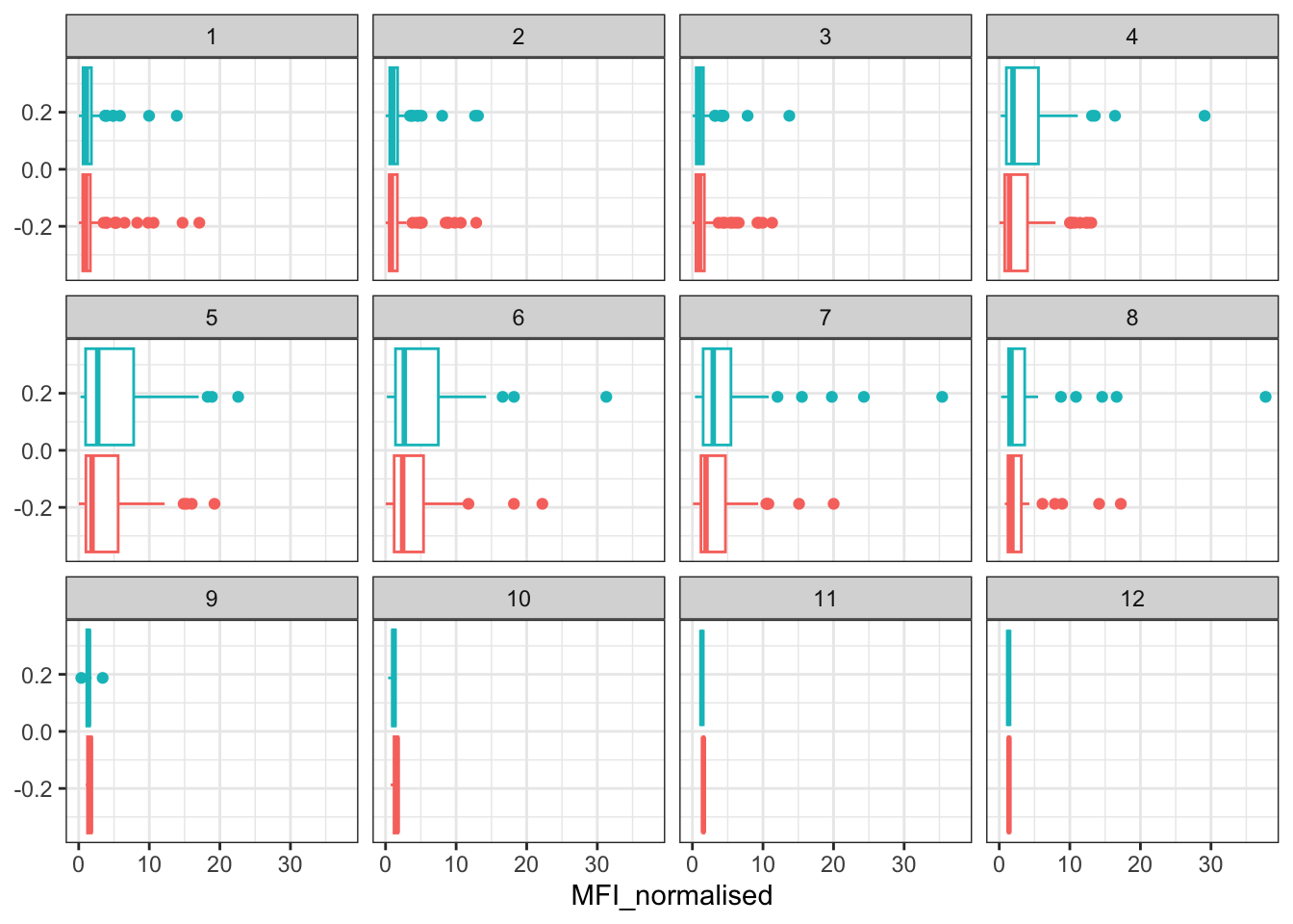
filter(igg, antigen=="FIM2/3") %>%
  ggplot() +
  aes(MFI_normalised, col=infancy_vac) +
  geom_boxplot(show.legend = FALSE) +
  facet_wrap(vars(visit)) +
  theme_bw()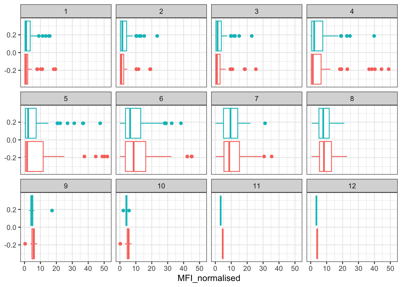
Q16. What do you notice about these two antigens time courses and the PT data in particular?
The two antigens have their levels increase over the course of the visits. In the PT data, PT levels rise and exceed OVA antigen levels. The trend follows similarly between wP and aP subjects.
Q17. Do you see any clear difference in aP vs. wP responses?
There does not seem to be a clear difference in aP vs. wP response as the ranges and medians seem to be close to each other.
# Filter to 2021 Dataset

ab.PT.21 <- abdata |> filter(dataset == "2021_dataset",
                              isotype == "IgG",  antigen == "PT")

ggplot(ab.PT.21) +
  aes(x=planned_day_relative_to_boost,
      y=MFI_normalised,
      col=infancy_vac,
      group=subject_id) +
  geom_point() +
  geom_line(alpha = 0.2) +

  # Line of Fit for aP and wP groups
  geom_smooth(aes(group = infancy_vac, col = infancy_vac),
              se = FALSE,
              span = 0.3) +

  geom_vline(xintercept=0, linetype="dashed") +
  geom_vline(xintercept=14, linetype="dashed") +
  labs(title="2021 dataset IgG PT",
       subtitle = "Dashed lines indicate day 0 (pre-boost) and 14 (apparent peak levels)")
`geom_smooth()` using method = 'loess' and formula = 'y ~ x'Warning in simpleLoess(y, x, w, span, degree = degree, parametric = parametric,
: pseudoinverse used at -0.6Warning in simpleLoess(y, x, w, span, degree = degree, parametric = parametric,
: neighborhood radius 3.6Warning in simpleLoess(y, x, w, span, degree = degree, parametric = parametric,
: reciprocal condition number 0Warning in simpleLoess(y, x, w, span, degree = degree, parametric = parametric,
: There are other near singularities as well. 11364Warning in simpleLoess(y, x, w, span, degree = degree, parametric = parametric,
: pseudoinverse used at -0.6Warning in simpleLoess(y, x, w, span, degree = degree, parametric = parametric,
: neighborhood radius 3.6Warning in simpleLoess(y, x, w, span, degree = degree, parametric = parametric,
: reciprocal condition number 0Warning in simpleLoess(y, x, w, span, degree = degree, parametric = parametric,
: There are other near singularities as well. 11364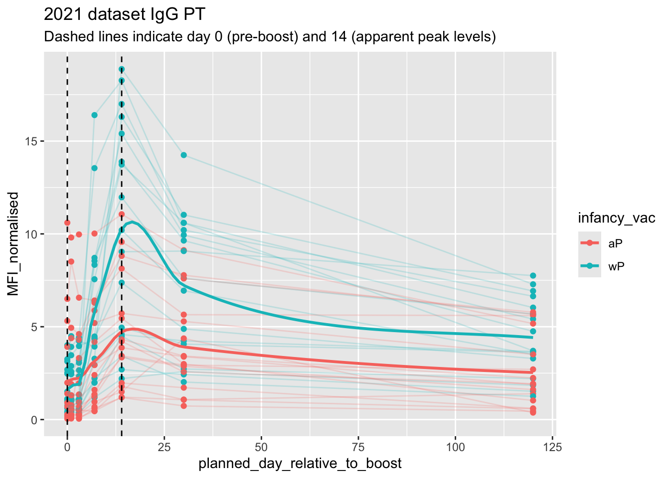
Q18. Does this trend look similar for the 2020 dataset?
In general, yes, the general trend looks similar to the 2020 dataset. However, there are a few differences with the 2020 dataset that are quite apparent such as the peaks between the “aP” and “wP” in the first 14 days.
# Filter to 2020 Dataset

ab.PT.20 <- abdata |> filter(dataset == "2020_dataset",
                              isotype == "IgG",  antigen == "PT")

ggplot(ab.PT.20) +
  aes(x=planned_day_relative_to_boost,
      y=MFI_normalised,
      col=infancy_vac,
      group=subject_id) +
  geom_point() +
  geom_line(alpha = 0.2) +
  geom_vline(xintercept=0, linetype="dashed") +
  geom_vline(xintercept=14, linetype="dashed") +
  labs(title="2020 dataset IgG PT",
subtitle = "Dashed lines indicate day 0 (pre-boost) and 14 (apparent peak levels)") 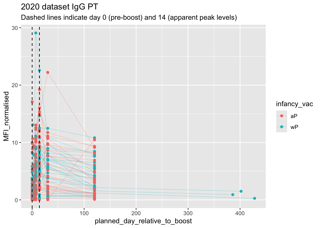
Obtaining CMI-PB RNASeq Data
url <- "https://www.cmi-pb.org/api/v2/rnaseq?versioned_ensembl_gene_id=eq.ENSG00000211896.7"

rna <- read_json(url, simplifyVector = TRUE)
#meta <- inner_join(specimen, subject)
ssrna <- inner_join(rna, meta)Joining with `by = join_by(specimen_id)`Q19. Make a plot of the time course of gene expression for IGHG1 gene (i.e. a plot of visit vs. tpm).
ggplot(ssrna) +
  aes(visit, tpm, group=subject_id) +
  geom_point() +
  geom_line(alpha=0.2)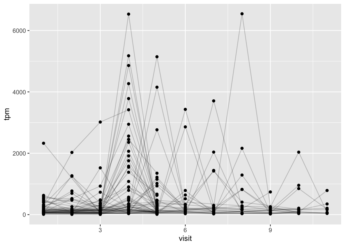
Q20.: What do you notice about the expression of this gene (i.e. when is it at it’s maximum level)?
The expression of the gene was at its maximal level on the 4th day of visit and slowly reduced over the course of the next two days. One subject seemed to linearly decrease expression while a majority of subjects decreased expression levels exponentially.
Q21. Does this pattern in time match the trend of antibody titer data? If not, why not?
Yes, this pattern in time matches the trend of antibody titer data. From the boxplot data above, we can see that the titer levels increased over a few days until week 4 and then progressively lowered.
ggplot(ssrna) +
  aes(tpm, col=infancy_vac) +
  geom_boxplot() +
  facet_wrap(vars(visit))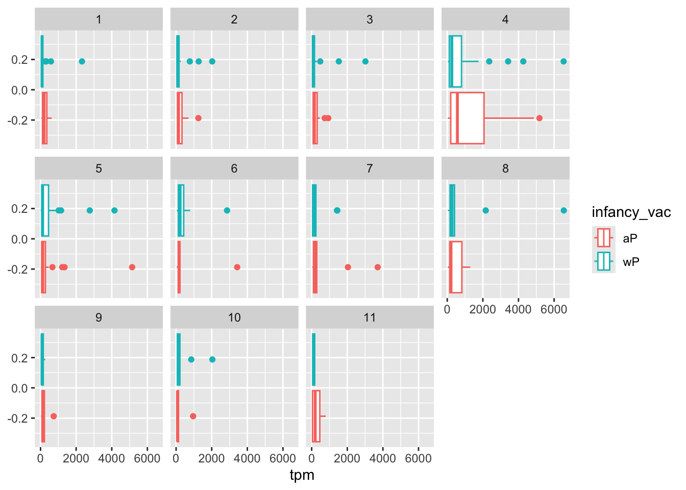
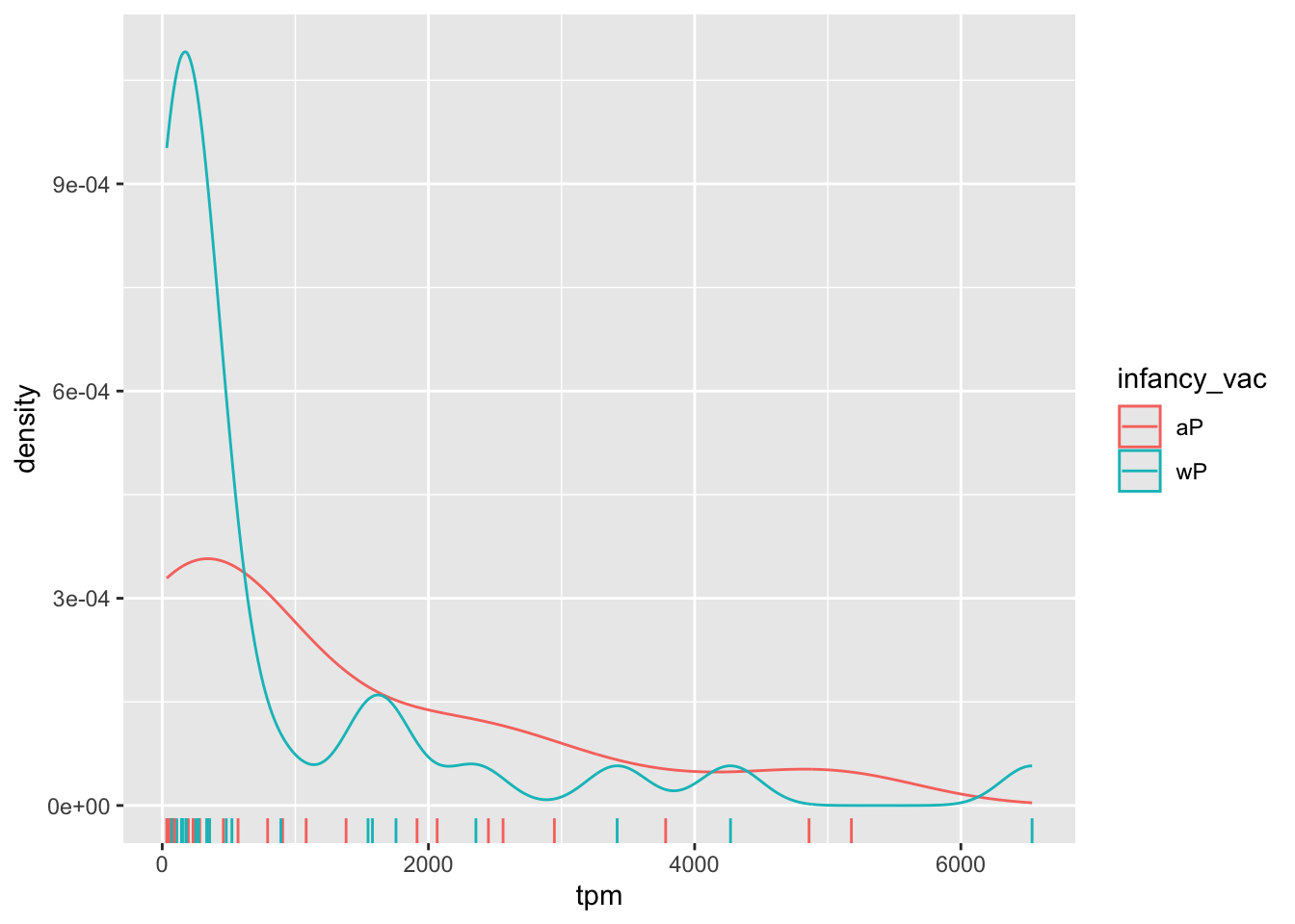
ssrna %>%
  filter(visit==4) %>%
  ggplot() +
    aes(tpm, col=infancy_vac) + geom_density() +
    geom_rug()