Brian's Bioinformatics Site
My Classwork for BIMM143
Class 08: Breast Cancer Mini Project
Brian Wong (PID: A18639001)
- Background
- Data Import
- Exploratory Data Analysis
- Principal Component Analysis
- Hiearchical Clustering
- Combining Methods
- Sensitivity/Specificity
- Prediction
Background
In today’s class we will apply the methods and techniques clustering and PCA to help make sense of a real world breast cancer FNA biopsy data set.
Data Import
We start by importing our data. It is a CSV file so we will use the
read.csv() function.
# Save your input data file into your Project directory
fna.data <- "WisconsinCancer.csv"

# Complete the following code to input the data and store as wisc.df
wisc.df <- read.csv(fna.data, row.names=1)

head(wisc.df, 4)
         diagnosis radius_mean texture_mean perimeter_mean area_mean
842302           M       17.99        10.38         122.80    1001.0
842517           M       20.57        17.77         132.90    1326.0
84300903         M       19.69        21.25         130.00    1203.0
84348301         M       11.42        20.38          77.58     386.1
         smoothness_mean compactness_mean concavity_mean concave.points_mean
842302           0.11840          0.27760         0.3001             0.14710
842517           0.08474          0.07864         0.0869             0.07017
84300903         0.10960          0.15990         0.1974             0.12790
84348301         0.14250          0.28390         0.2414             0.10520
         symmetry_mean fractal_dimension_mean radius_se texture_se perimeter_se
842302          0.2419                0.07871    1.0950     0.9053        8.589
842517          0.1812                0.05667    0.5435     0.7339        3.398
84300903        0.2069                0.05999    0.7456     0.7869        4.585
84348301        0.2597                0.09744    0.4956     1.1560        3.445
         area_se smoothness_se compactness_se concavity_se concave.points_se
842302    153.40      0.006399        0.04904      0.05373           0.01587
842517     74.08      0.005225        0.01308      0.01860           0.01340
84300903   94.03      0.006150        0.04006      0.03832           0.02058
84348301   27.23      0.009110        0.07458      0.05661           0.01867
         symmetry_se fractal_dimension_se radius_worst texture_worst
842302       0.03003             0.006193        25.38         17.33
842517       0.01389             0.003532        24.99         23.41
84300903     0.02250             0.004571        23.57         25.53
84348301     0.05963             0.009208        14.91         26.50
         perimeter_worst area_worst smoothness_worst compactness_worst
842302            184.60     2019.0           0.1622            0.6656
842517            158.80     1956.0           0.1238            0.1866
84300903          152.50     1709.0           0.1444            0.4245
84348301           98.87      567.7           0.2098            0.8663
         concavity_worst concave.points_worst symmetry_worst
842302            0.7119               0.2654         0.4601
842517            0.2416               0.1860         0.2750
84300903          0.4504               0.2430         0.3613
84348301          0.6869               0.2575         0.6638
         fractal_dimension_worst
842302                   0.11890
842517                   0.08902
84300903                 0.08758
84348301                 0.17300
Make sure to remove the first diagnosis column - I don’t want to use
this for my machine learning models. We will use it later to compare our
results to the expert diagnosis.
# We can use -1 here to remove the first column
wisc.data <- wisc.df[,-1]

# Create diagnosis vector for later
diagnosis <- wisc.df$diagnosis
Exploratory Data Analysis
Q1. How many observations are in this dataset?
nrow(wisc.df)
[1] 569
Q2. How many of the observations have a malignant diagnosis?
sum(diagnosis == "M")
[1] 212
Q3. How many variables/features in the data are suffixed with _mean?
length(grep("_mean", colnames(wisc.data)))
[1] 10
Principal Component Analysis
The main function here is prcomp() and we want to make sure we set the
optional argument scale = TRUE:
Performing PCA
# Check column means and standard deviations
colMeans(wisc.data)
            radius_mean            texture_mean          perimeter_mean
           1.412729e+01            1.928965e+01            9.196903e+01
              area_mean         smoothness_mean        compactness_mean
           6.548891e+02            9.636028e-02            1.043410e-01
         concavity_mean     concave.points_mean           symmetry_mean
           8.879932e-02            4.891915e-02            1.811619e-01
 fractal_dimension_mean               radius_se              texture_se
           6.279761e-02            4.051721e-01            1.216853e+00
           perimeter_se                 area_se           smoothness_se
           2.866059e+00            4.033708e+01            7.040979e-03
         compactness_se            concavity_se       concave.points_se
           2.547814e-02            3.189372e-02            1.179614e-02
            symmetry_se    fractal_dimension_se            radius_worst
           2.054230e-02            3.794904e-03            1.626919e+01
          texture_worst         perimeter_worst              area_worst
           2.567722e+01            1.072612e+02            8.805831e+02
       smoothness_worst       compactness_worst         concavity_worst
           1.323686e-01            2.542650e-01            2.721885e-01
   concave.points_worst          symmetry_worst fractal_dimension_worst
           1.146062e-01            2.900756e-01            8.394582e-02
apply(wisc.data,2,sd)
            radius_mean            texture_mean          perimeter_mean
           3.524049e+00            4.301036e+00            2.429898e+01
              area_mean         smoothness_mean        compactness_mean
           3.519141e+02            1.406413e-02            5.281276e-02
         concavity_mean     concave.points_mean           symmetry_mean
           7.971981e-02            3.880284e-02            2.741428e-02
 fractal_dimension_mean               radius_se              texture_se
           7.060363e-03            2.773127e-01            5.516484e-01
           perimeter_se                 area_se           smoothness_se
           2.021855e+00            4.549101e+01            3.002518e-03
         compactness_se            concavity_se       concave.points_se
           1.790818e-02            3.018606e-02            6.170285e-03
            symmetry_se    fractal_dimension_se            radius_worst
           8.266372e-03            2.646071e-03            4.833242e+00
          texture_worst         perimeter_worst              area_worst
           6.146258e+00            3.360254e+01            5.693570e+02
       smoothness_worst       compactness_worst         concavity_worst
           2.283243e-02            1.573365e-01            2.086243e-01
   concave.points_worst          symmetry_worst fractal_dimension_worst
           6.573234e-02            6.186747e-02            1.806127e-02
# Perform PCA on wisc.data by completing the following code
wisc.pr <- prcomp(wisc.data, scale = TRUE)
# Look at summary of results
summary(wisc.pr)
Importance of components:
                          PC1    PC2     PC3     PC4     PC5     PC6     PC7
Standard deviation     3.6444 2.3857 1.67867 1.40735 1.28403 1.09880 0.82172
Proportion of Variance 0.4427 0.1897 0.09393 0.06602 0.05496 0.04025 0.02251
Cumulative Proportion  0.4427 0.6324 0.72636 0.79239 0.84734 0.88759 0.91010
                           PC8    PC9    PC10   PC11    PC12    PC13    PC14
Standard deviation     0.69037 0.6457 0.59219 0.5421 0.51104 0.49128 0.39624
Proportion of Variance 0.01589 0.0139 0.01169 0.0098 0.00871 0.00805 0.00523
Cumulative Proportion  0.92598 0.9399 0.95157 0.9614 0.97007 0.97812 0.98335
                          PC15    PC16    PC17    PC18    PC19    PC20   PC21
Standard deviation     0.30681 0.28260 0.24372 0.22939 0.22244 0.17652 0.1731
Proportion of Variance 0.00314 0.00266 0.00198 0.00175 0.00165 0.00104 0.0010
Cumulative Proportion  0.98649 0.98915 0.99113 0.99288 0.99453 0.99557 0.9966
                          PC22    PC23   PC24    PC25    PC26    PC27    PC28
Standard deviation     0.16565 0.15602 0.1344 0.12442 0.09043 0.08307 0.03987
Proportion of Variance 0.00091 0.00081 0.0006 0.00052 0.00027 0.00023 0.00005
Cumulative Proportion  0.99749 0.99830 0.9989 0.99942 0.99969 0.99992 0.99997
                          PC29    PC30
Standard deviation     0.02736 0.01153
Proportion of Variance 0.00002 0.00000
Cumulative Proportion  1.00000 1.00000
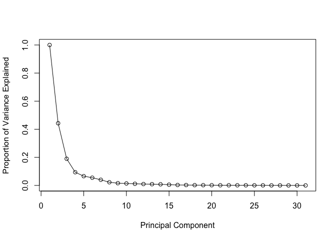
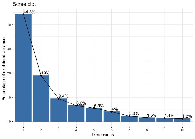
Q4. From your results, what proportion of the original variance is captured by the first principal component (PC1)?
44.27% of the original variance is captured by the first principal component (PC1)
Q5. How many principal components (PCs) are required to describe at least 70% of the original variance in the data?
The first 3 PCs add up to 72.64% of the original variance. Hence 3 PCs are required to describe at least 70% of the original variance in the data.
Q6. How many principal components (PCs) are required to describe at least 90% of the original variance in the data?
The first 7 PCs add up to 91.01% of the original varaiance. Hence 7 PCs are required to describe at least 90% of the original variance in the data.
Interpreting PCA results
Q7. What stands out to you about this plot? Is it easy or difficult to understand? Why?
The plot is extremely difficult to understand. The labels are overlapping with each other and is unreadable. Also the data overlaps with each other and is not visible for us to interpret.
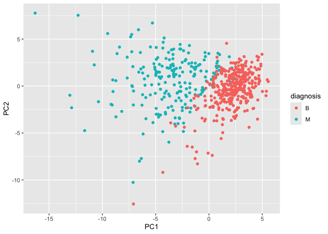
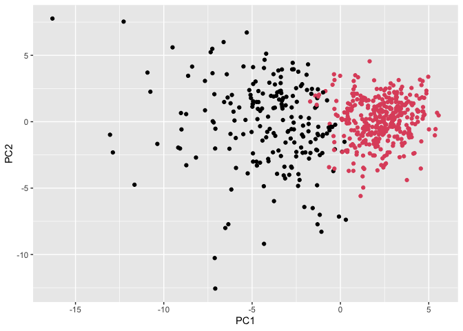
Our main PCA “score plot” or “PC plot” of results”
# Scatter plot observations by components 1 and 2
library(ggplot2)

ggplot(wisc.pr$x) +
  aes(PC1, PC2, col=diagnosis) +
  geom_point()
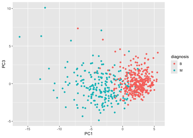
Q8. Generate a similar plot for principal components 1 and 3. What do you notice about these plots?
The plots slightly differ in how the points are spread. On the PC2 versus PC3 scale, it seems that the points on the PC2 scale are spread out more while the points on the PC3 scale are slightly more packed.
# Repeat for components 1 and 3
ggplot(wisc.pr$x) +
  aes(PC1, PC3, col=diagnosis) +
  geom_point()
Variance Explained
# Calculate variance of each component
pr.var <- wisc.pr$sdev^2
head(pr.var)
[1] 13.281608 5.691355 2.817949 1.980640 1.648731 1.207357
# Variance explained by each principal component: pve
pve <- pr.var / sum(pr.var)

# Plot variance explained for each principal component
plot(c(1,pve), xlab = "Principal Component",
     ylab = "Proportion of Variance Explained",
     ylim = c(0, 1), type = "o")
# Alternative scree plot of the same data, note data driven y-axis
barplot(pve, ylab = "Percent of Variance Explained",
     names.arg=paste0("PC",1:length(pve)), las=2, axes = FALSE)
axis(2, at=pve, labels=round(pve,2)*100 )
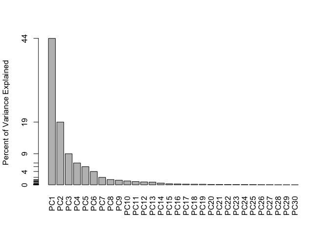
## ggplot based graph
#install.packages("factoextra")
library(factoextra)
Welcome! Want to learn more? See two factoextra-related books at https://goo.gl/ve3WBa
fviz_eig(wisc.pr, addlabels = TRUE)
Communicating PCA Results
Q9. For the first principal component, what is the component of the loading vector (i.e. wisc.pr$rotation[,1]) for the feature concave.points_mean? This tells us how much this original feature contributes to the first PC. Are there any features with larger contributions than this one?
The component of the loading vector for the feature concave.points_mean is -0.2608538. There are no other features with larger contriutions than this one.
ggplot(wisc.pr$rotation) + aes(PC1, (rownames(wisc.pr$rotation))) + geom_col()
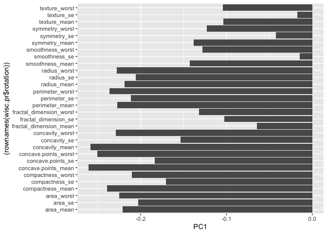
wisc.pr$rotation["concave.points_mean",1]
[1] -0.2608538
wisc.pr$rotation[,1]
            radius_mean            texture_mean          perimeter_mean
            -0.21890244             -0.10372458             -0.22753729
              area_mean         smoothness_mean        compactness_mean
            -0.22099499             -0.14258969             -0.23928535
         concavity_mean     concave.points_mean           symmetry_mean
            -0.25840048             -0.26085376             -0.13816696
 fractal_dimension_mean               radius_se              texture_se
            -0.06436335             -0.20597878             -0.01742803
           perimeter_se                 area_se           smoothness_se
            -0.21132592             -0.20286964             -0.01453145
         compactness_se            concavity_se       concave.points_se
            -0.17039345             -0.15358979             -0.18341740
            symmetry_se    fractal_dimension_se            radius_worst
            -0.04249842             -0.10256832             -0.22799663
          texture_worst         perimeter_worst              area_worst
            -0.10446933             -0.23663968             -0.22487053
       smoothness_worst       compactness_worst         concavity_worst
            -0.12795256             -0.21009588             -0.22876753
   concave.points_worst          symmetry_worst fractal_dimension_worst
            -0.25088597             -0.12290456             -0.13178394
Hiearchical Clustering
First scale the data (with the scale() function), then calculate a
distance matrix (with the dist() function). Then cluster with
hclust() function and plot.
# Scale the wisc.data data using the "scale()" function
data.scaled <- scale(wisc.data)
data.dist <- dist(data.scaled)
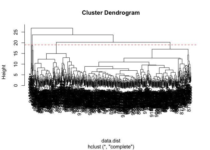
wisc.hclust <- hclust(data.dist, method = "complete")
Results of Hiearchical Clustering
Q10. Using the plot() and abline() functions, what is the height at which the clustering model has 4 clusters?
Just right below height 20, is when the clustering model has 4 clusters.
plot(wisc.hclust)
abline(h=19, col="red", lty=2)
Selecting Number of Clusters
You can also use cutree() function with a argument k=4 rather than
h = height
wisc.hclust.clusters <- cutree(wisc.hclust, k=4)

table(wisc.hclust.clusters, diagnosis)
                    diagnosis
wisc.hclust.clusters   B   M
                   1  12 165
                   2   2   5
                   3 343  40
                   4   0   2
Q11. OPTIONAL: Can you find a better cluster vs diagnoses match by cutting into a different number of clusters between 2 and 6? How do you judge the quality of your result in each case?
There are different definitions of quality that may vary between clustering.
Using Different Methods
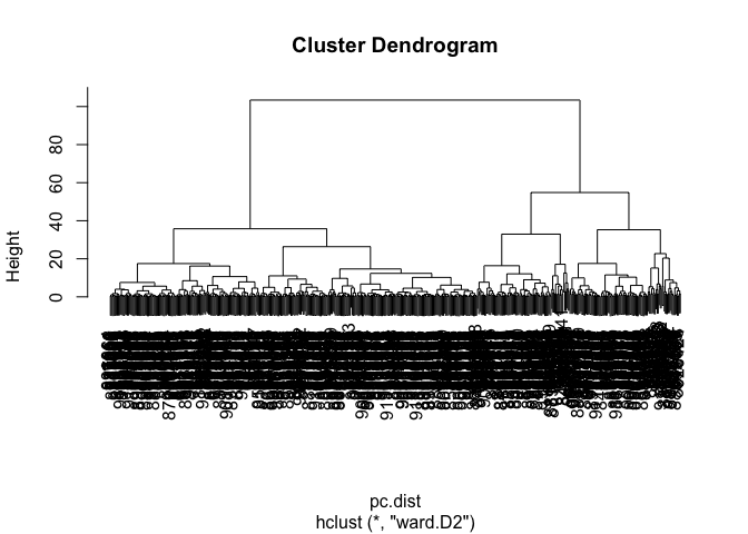
Q12. Which method gives your favorite results for the same data.dist dataset? Explain your reasoning.
Using “ward.D2” gives the favored result in my opinion. The first few clusters are easy to see and there is a clear difference in Height among them as opposed to methods like “single”.
wisc.hclust2 <- hclust(data.dist, method = "ward.D2")
plot(wisc.hclust2)

Combining Methods
Here we will take our PCA results and use those as input for clustering.
In other words our wisc.pr$x scores that we plotted above (the main
output from PCA - how the data lie on our new principal component
axis/variables) and use a subset of the PCs that capture the most
variance as input for hclust()
Clustering PCA Results
pc.dist <- dist(wisc.pr$x[,1:3])
wisc.pr.hclust <- hclust(pc.dist, method = "ward.D2")
plot(wisc.pr.hclust)
Cut the dendrogram/tree into two main groups/clusters:
grps <- cutree(wisc.pr.hclust, k=2)
table(grps)
grps
  1   2
203 366
I want to know how the clustering in grps with values of 1 or 2
correspond to the expert diagnosis
table(grps, diagnosis)
    diagnosis
grps   B   M
   1  24 179
   2 333  33
My clustering group 1 are mostly “M” diagnosis (179) and my clustering group 2 are mostly “B” diagnosis.
24 False Positives (FP) 179 True Positives (TP) 333 True Negatives (TN) 33 False Negatives (FN)
ggplot(wisc.pr$x) +
  aes(PC1, PC2) +
  geom_point(col=grps)
Q13. How well does the newly created hclust model with two clusters separate out the two “M” and “B” diagnoses?
There are 24 False Positives (FP), 179 True Positives (TP), 333 True Negatives (TN), 33 False Negatives (FN) in this newly created hclust model with 2 clusters of “M” and “B” diagnoses.
table(grps, diagnosis)
    diagnosis
grps   B   M
   1  24 179
   2 333  33
Q14. How well do the hierarchical clustering models you created in the previous sections (i.e. without first doing PCA) do in terms of separating the diagnoses? Again, use the table() function to compare the output of each model (wisc.hclust.clusters and wisc.pr.hclust.clusters) with the vector containing the actual diagnoses.
There are more groups in the original cluster with few individuals in the 2 separate groups. There seems to be relatively less False Positives in group 1, but slightly more false negatives in group 2.
table(wisc.hclust.clusters, diagnosis)
                    diagnosis
wisc.hclust.clusters   B   M
                   1  12 165
                   2   2   5
                   3 343  40
                   4   0   2
table(grps, diagnosis)
    diagnosis
grps   B   M
   1  24 179
   2 333  33
Sensitivity/Specificity
Sensitivity TP/(TP+FN)
179/(179+33)
[1] 0.8443396
Specificity TN/(TN+FP)
333/(333 + 24)
[1] 0.9327731
Prediction
#url <- "new_samples.csv"
url <- "https://tinyurl.com/new-samples-CSV"
new <- read.csv(url)
npc <- predict(wisc.pr, newdata=new)
npc
           PC1       PC2        PC3        PC4       PC5        PC6        PC7
[1,]  2.576616 -3.135913  1.3990492 -0.7631950  2.781648 -0.8150185 -0.3959098
[2,] -4.754928 -3.009033 -0.1660946 -0.6052952 -1.140698 -1.2189945  0.8193031
            PC8       PC9       PC10      PC11      PC12      PC13     PC14
[1,] -0.2307350 0.1029569 -0.9272861 0.3411457  0.375921 0.1610764 1.187882
[2,] -0.3307423 0.5281896 -0.4855301 0.7173233 -1.185917 0.5893856 0.303029
          PC15       PC16        PC17        PC18        PC19       PC20
[1,] 0.3216974 -0.1743616 -0.07875393 -0.11207028 -0.08802955 -0.2495216
[2,] 0.1299153  0.1448061 -0.40509706  0.06565549  0.25591230 -0.4289500
           PC21       PC22       PC23       PC24        PC25         PC26
[1,]  0.1228233 0.09358453 0.08347651  0.1223396  0.02124121  0.078884581
[2,] -0.1224776 0.01732146 0.06316631 -0.2338618 -0.20755948 -0.009833238
             PC27        PC28         PC29         PC30
[1,]  0.220199544 -0.02946023 -0.015620933  0.005269029
[2,] -0.001134152  0.09638361  0.002795349 -0.019015820
plot(wisc.pr$x[,1:2], col=grps)
points(npc[,1], npc[,2], col="blue", pch=16, cex=3)
text(npc[,1], npc[,2], c(1,2), col="white")
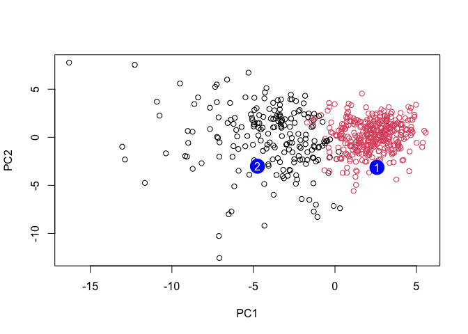
Q16. Which of these new patients should we prioritize for follow up based on your results?
We should prioritize these new patients in group 2 for a follow up.